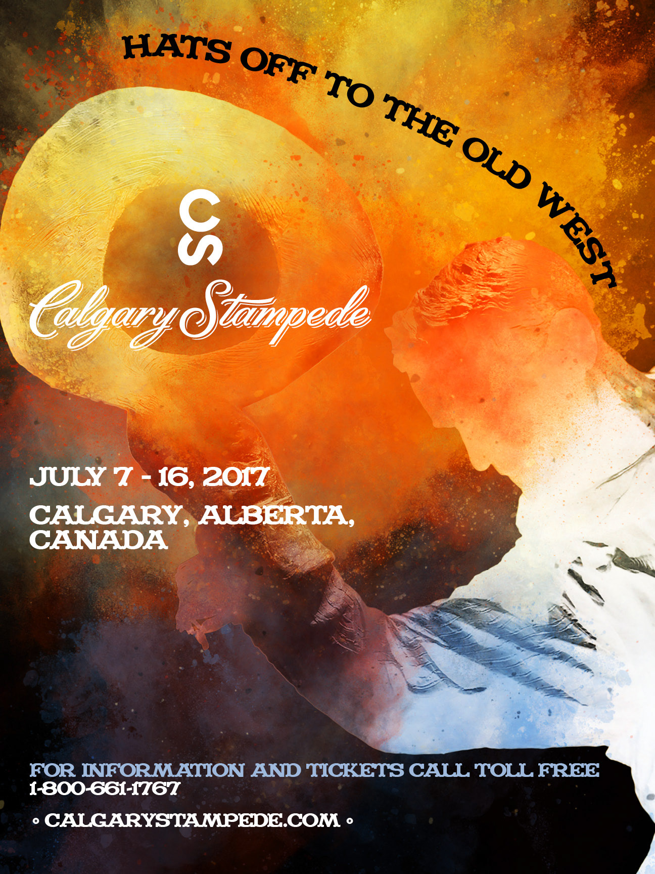

Challenge:
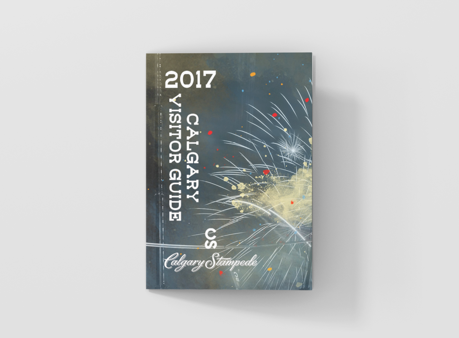
As part of my "Layout and Typography" course at the Southern Alberta Institute of Technology (S.A.I.T.), I was tasked with creating a marketing package for the Calgary Stampede, consisting of both a poster and brochure.
(Note: This project was a design exercise and was not intended for public use.)
Approach:
To potentially represent the spirit of the Calgary Stampede, I combined traditional Western typography with contemporary imagery, aiming to strike a balance between heritage and modern appeal.
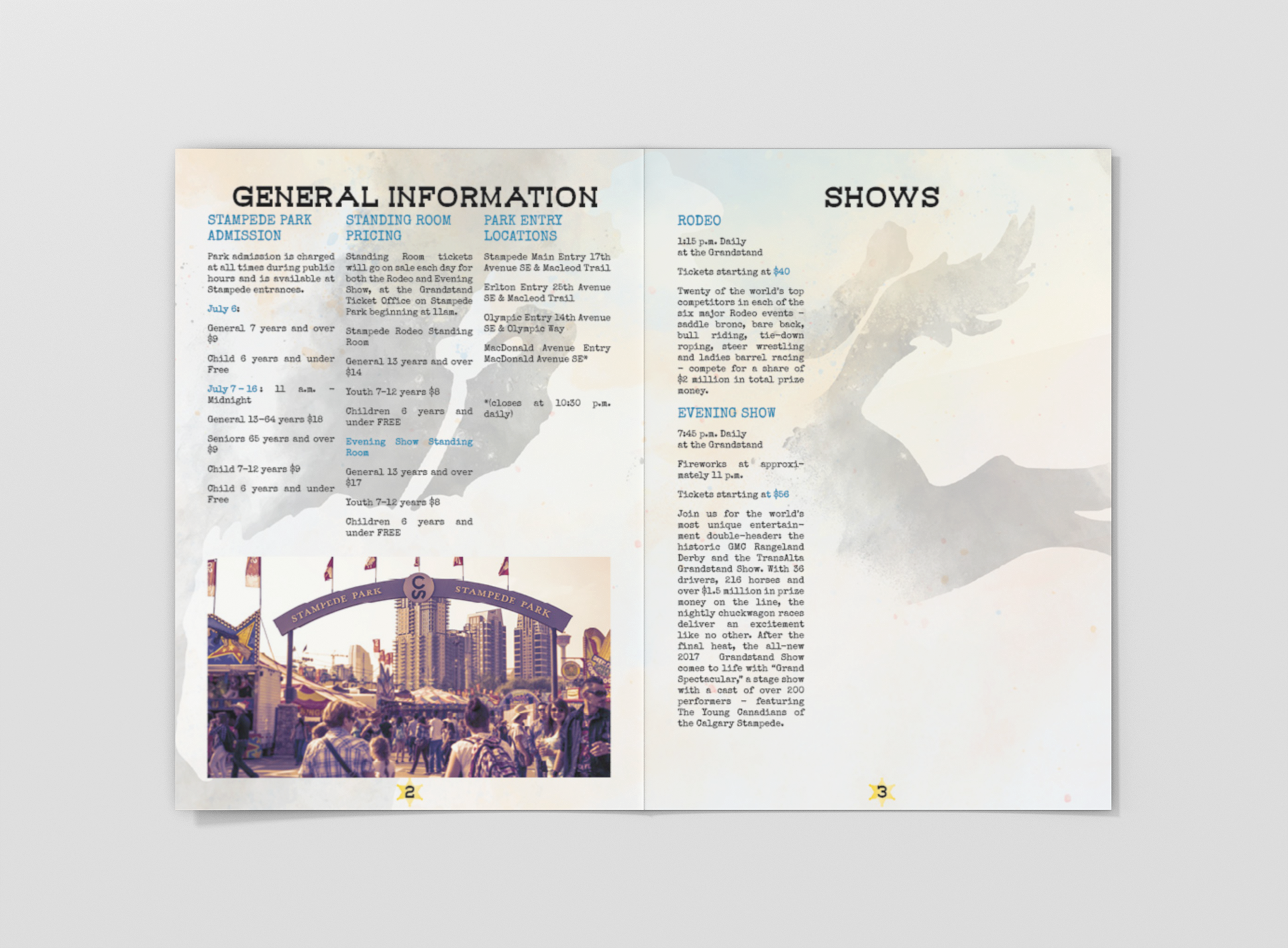
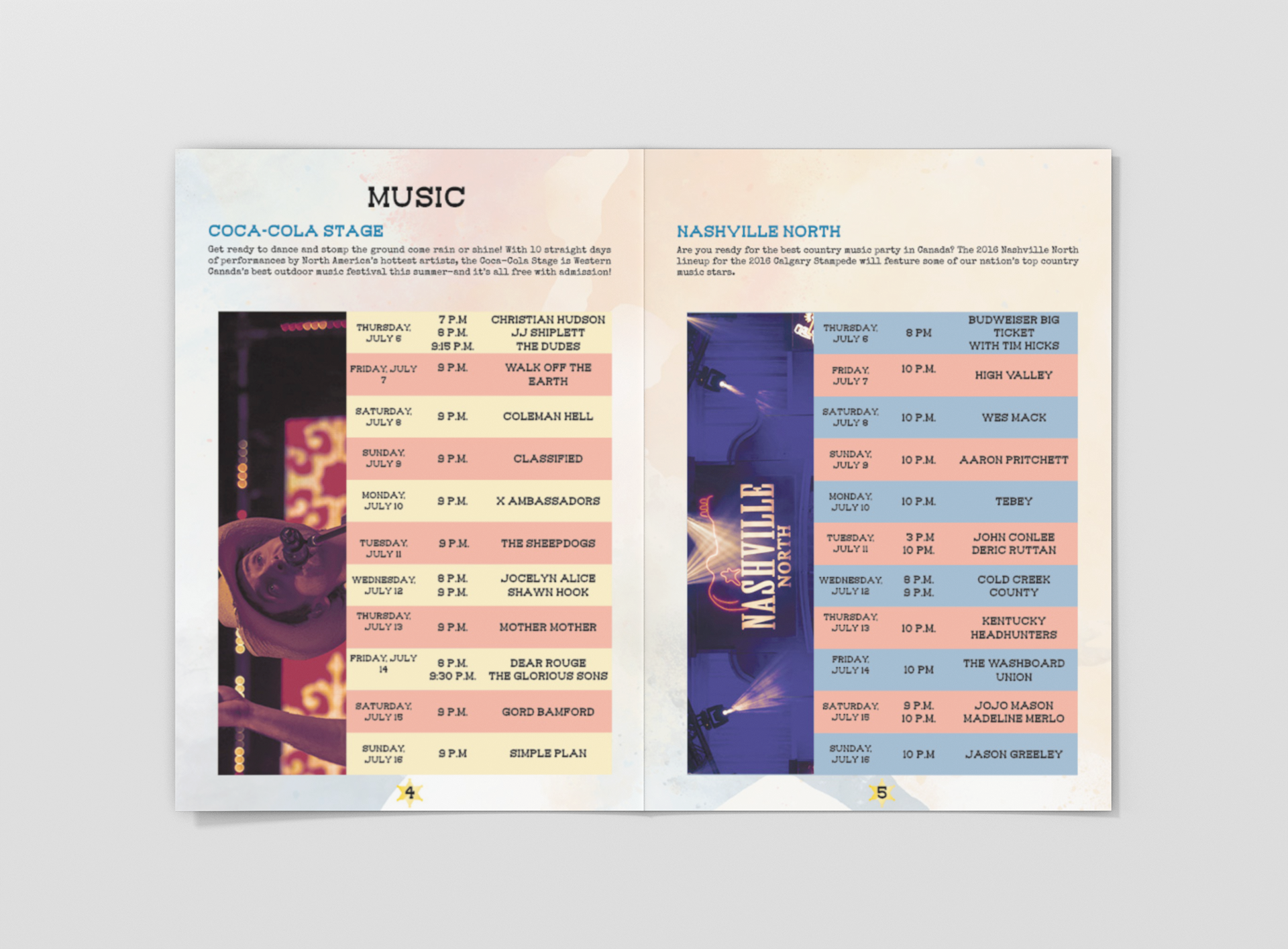
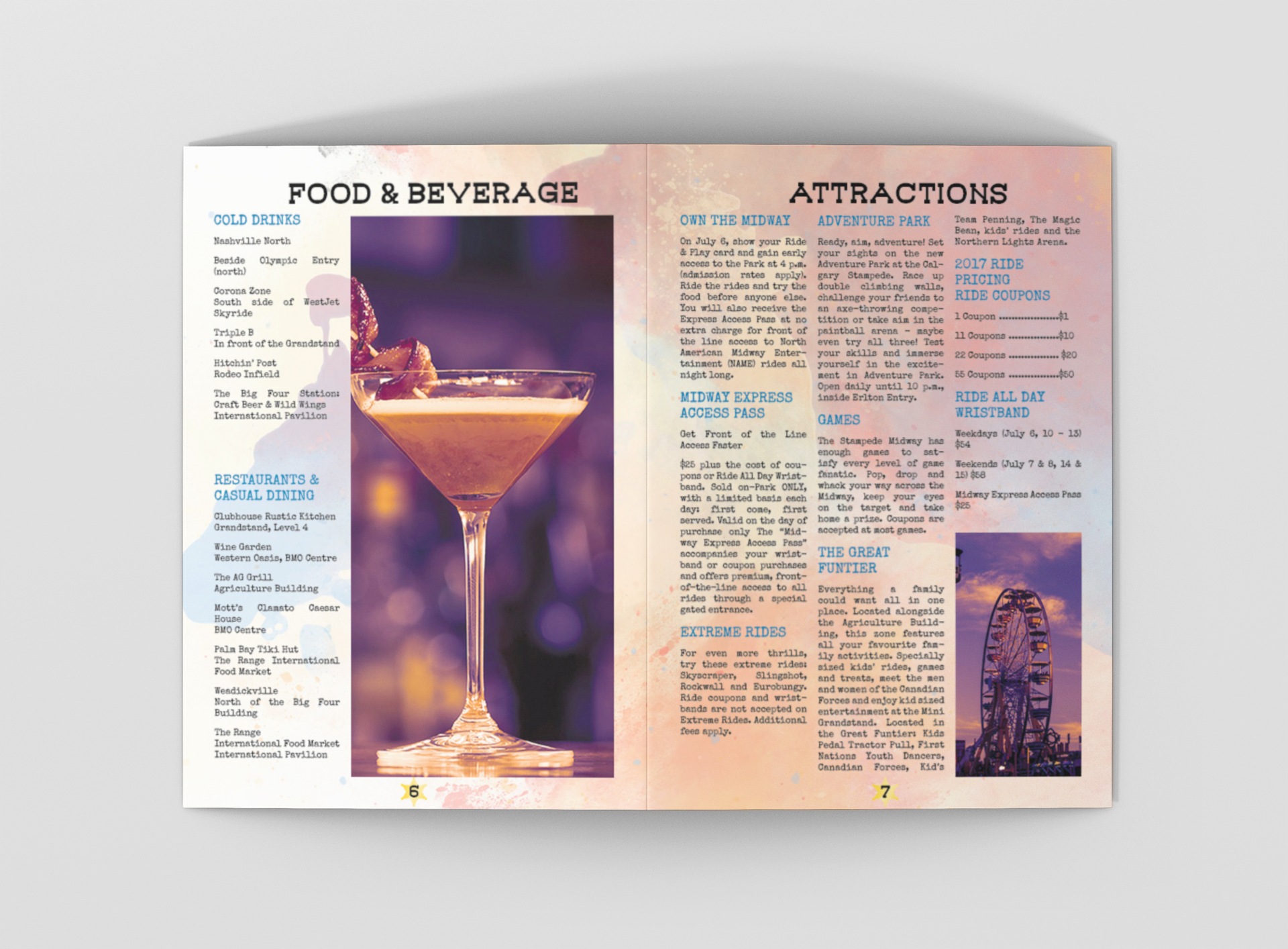
My design decisions focused on image selection, typography, and layout. Image selection involved evocative visuals that captured the event's excitement and tradition. Typography combined Western and modern fonts for nostalgia and readability, while layout used grids, master pages, and style guides for consistency.
Result:
The final deliverables included:
An 18" x 24" poster, designed with two spot colors to create a high-impact promotional piece.
A multi-page, 7" x 10" brochure, printed on 80# Cover and 80# Text stock, providing a polished, professional feel.
By integrating strong visual hierarchy, typographic structure, and thoughtful imagery, this marketing campaign, it is assumed, successfully captured the energy and heritage of the Calgary Stampede while remaining visually cohesive across multiple formats.
In a juried review by industry experts from the Alberta College of Art and Design, Light Rock Printing Services, and Quintaro Imaging, my Calgary Stampede marketing materials (poster, brochure, and tickets) were selected as one of the top three submissions. Even though the work was not displayed in class, this professional endorsement still shows an acceptance of my design approach and execution