Challenge:
I was tasked to work on Synergy's newest initiative, Restorative Justice.
My Approach:
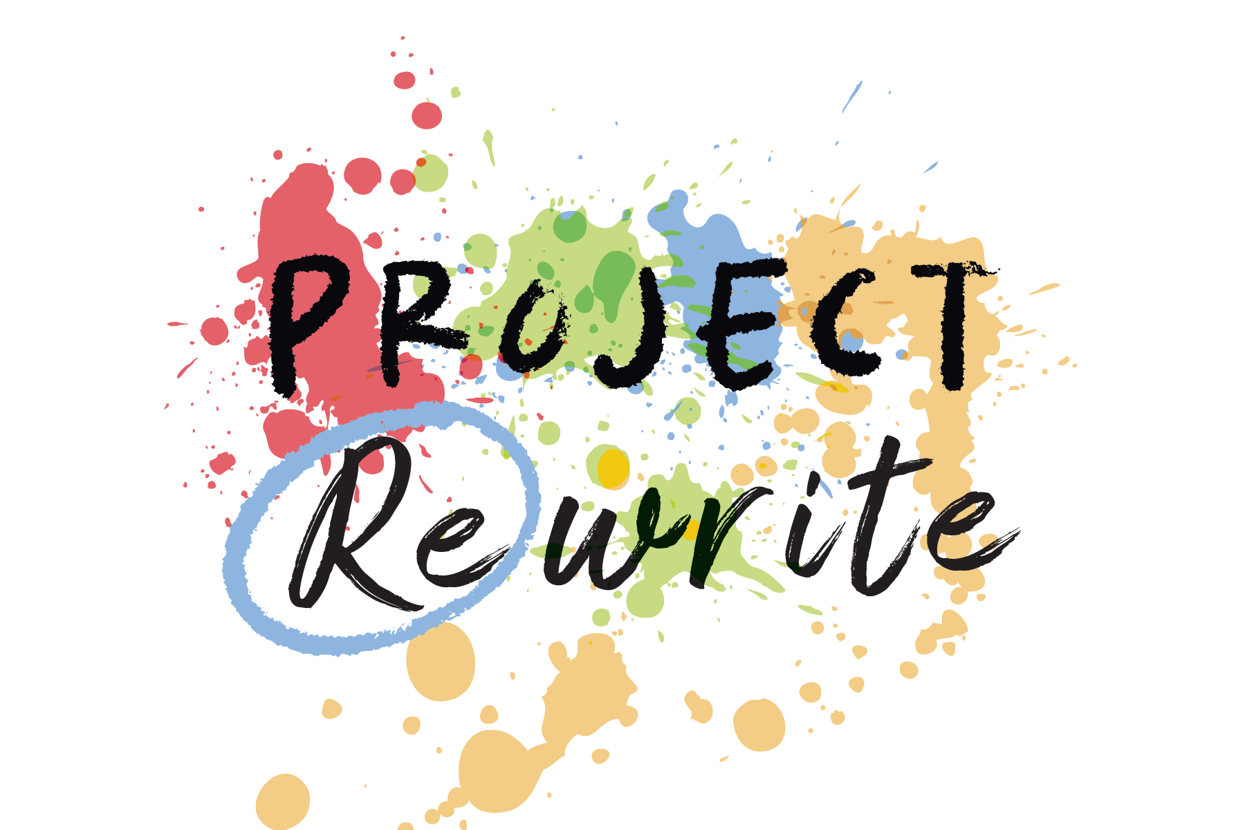
I researched imagery that would be appropriate for Restorative Justice. I created multiple logos, and Synergy employees voted on their favourite.
The correction mark on "Re" represents the opportunity for individuals who cause harm to take responsibility in the aftermath of a crime. The paint splatters reflect the holistic effects that will result from participating in the program, promoting healing and challenging everyone to work towards harmony.
I chose warm colours, a similar yet corresponding colour scheme to Synergy's logo, and a sans-serif font that reflects a friendly tone for the program.
Result:
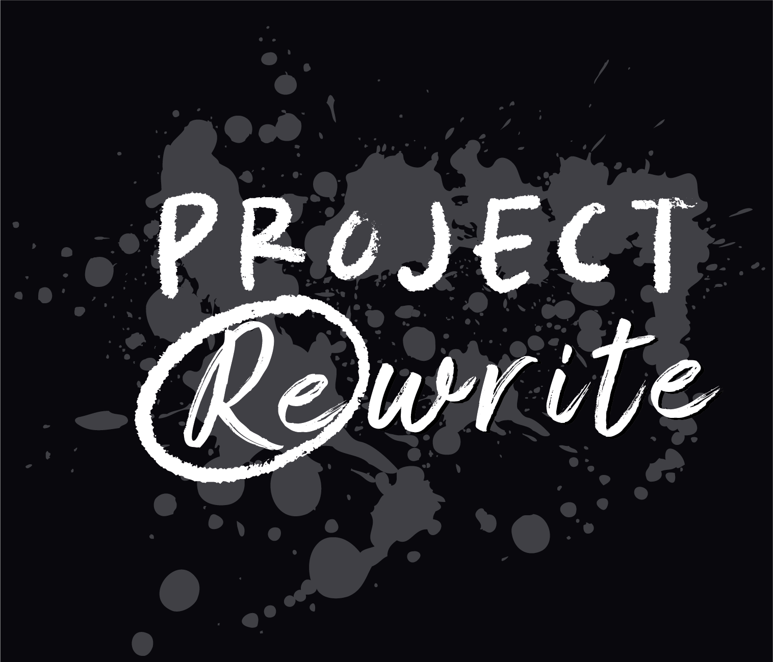
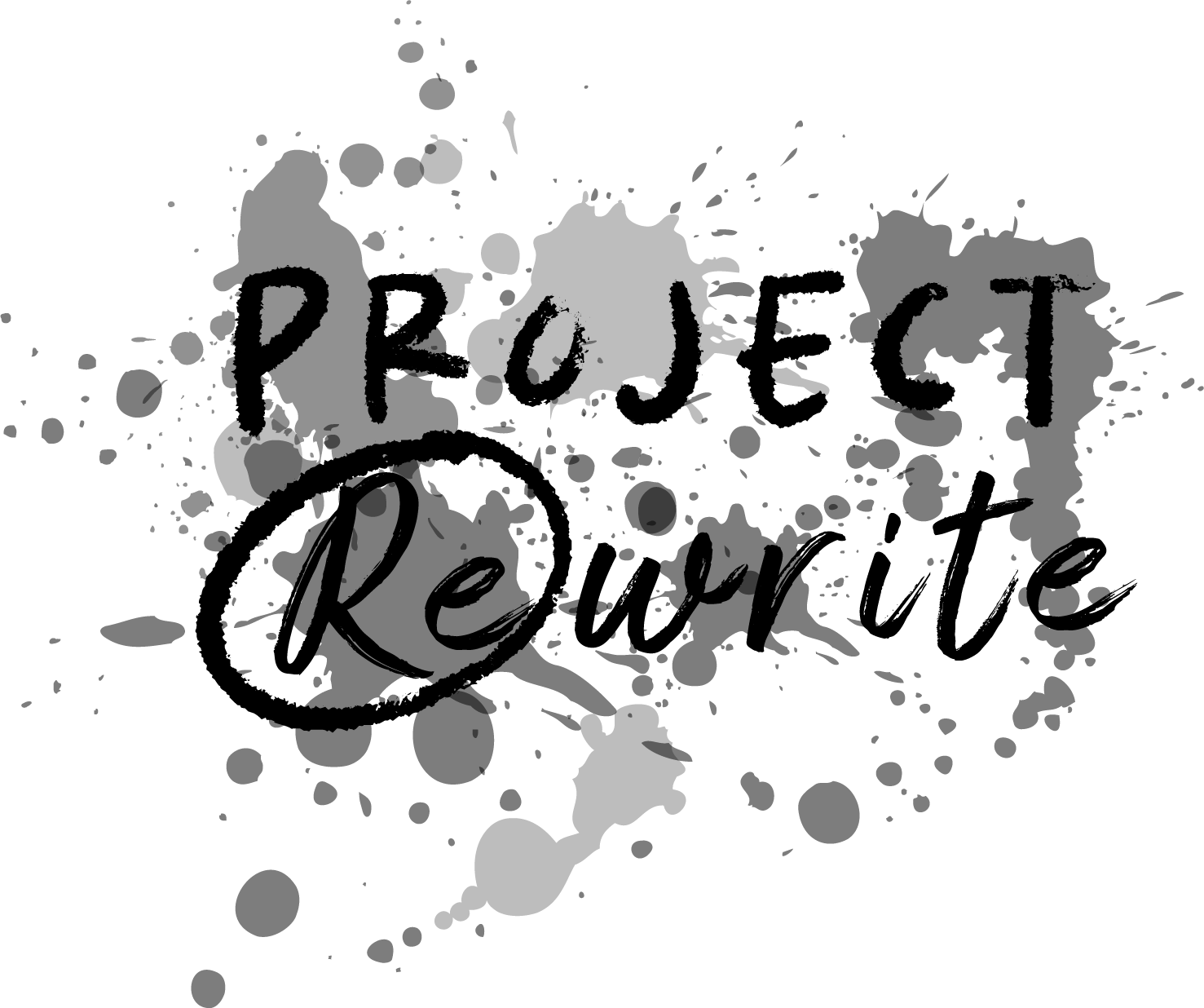
I created different variants of the design in colourful, black and white, and greyscale formats for printing.